Case studyIndian food-delivery brand
Two master concepts, nineteen SKUs, ninety-five boards in three hours.
A food-delivery brand adapting the same two campaign concepts across its whole menu, one SKU at a time, at twenty to thirty creatives a week. We catalogued their back library and rebuilt the run as a request: two masters and a list of SKUs in, ninety-five layered boards out.
- Sector
- Food delivery, India
- Scope
- 19 SKUs · 95 boards · 5 formats
- Turnaround
- 3 hours
- Previously
- A week per set, 20–30 creatives
- 95
- boards, from 2 approved concepts
- 5×
- the weekly output — 150+ against 20–30
- 0
- flattened files — every board shipped editable
Figures are the delivered batch, counted from the export manifest, and the weekly cadence is the client's own. The client is not named under a confidentiality agreement.
The brief
One concept, and a menu to say it about.
The campaign is not the hard part. A concept arrives approved — a dish on a green wall, a headline, an offer badge, a sign saying the kitchen is open till four — and it is right the first time. Then it has to be true of ninety-one products: a biryani, a cold coffee, a dessert jar in a kunafa glass, each with its own photograph and its own idea of where the food sits in the frame.
So every campaign was a menu-length production job, and every SKU in it was five boards. At twenty to thirty creatives a week, the calendar was set by how many a designer could get through.
- The constraint that mattered
- Not the first version of a board — the second. Every set came back with comments, and a flat batch is one where answering a comment means re-making the board it is about, then remembering to make the same change on eighteen others.
The approach
Catalogue the library. Then make the request the unit of work.
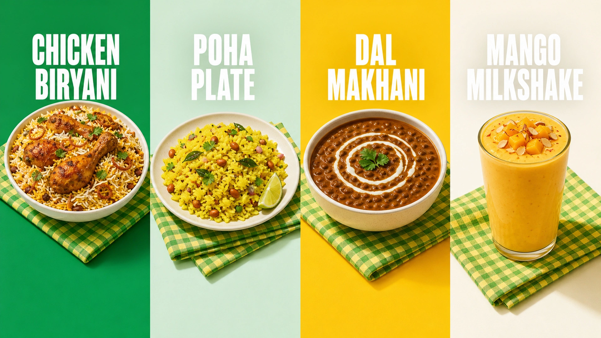
The first delivery was not a creative at all — it was a searchable catalogue of the brand's own back library, and it is the block below. On top of it, the unit of work stopped being a board and became a request: here are the approved masters, here are the SKUs we want.
The platform reads the library for each SKU, composes the board, and produces it at all five delivery formats as a layered document — ground, dish, headline, offer badge, sign, lockup — with nothing flattened. A designer opens the result and edits it; they do not rebuild it.
- A comment is answered once, then it stops being a comment
- The review on the first set was that copy crossed the story guides. It was fixed on the board — then kept as a rule the rest of the batch is measured against, so the nineteenth SKU never had to be told what the first was told.
What shipped
Two approved concepts in, ninety-five boards out — nineteen SKUs at five formats, in three hours against a week, every one an editable document rather than an export. The number the client cares about is what came after: twenty or thirty creatives a week became more than a hundred and fifty, on the same team.
The library
Every SKU, every creative they'd made.
Two hundred and twenty-four creatives already existed for these products — the best reference in the building for what any given SKU should look like, and unfindable. The frame names had stopped being true: a frame called BIRYANI holds the peri-peri-fries creative, one called Potato Wedges holds the peri-peri maggi. So the first delivery was a catalogue keyed on what the boards actually say.
- SKUs, across 48 families
- 91
- creatives, none unmapped
- 224
- photographs, indexed by what they show
- 248
- creatives flagged for a human to check
- 51
SKUs, across 48 families
creatives, none unmapped
photographs, indexed by what they show
creatives flagged for a human to check
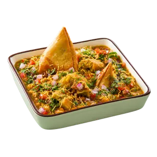
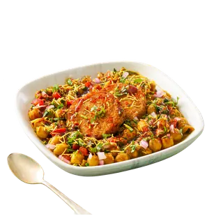
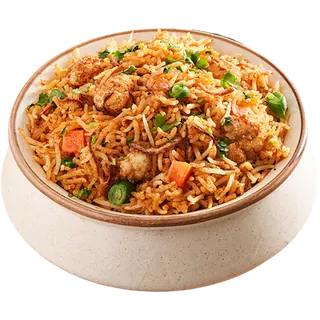
- 1Bhel Puri0.646
- 2Masala Peanut Chaat0.624
- 3Dahi Papdi Chaat0.624
- 4Sprouts Chaat0.620
- 5Peri Peri French Fries0.619
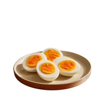
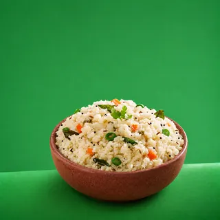
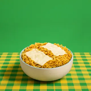
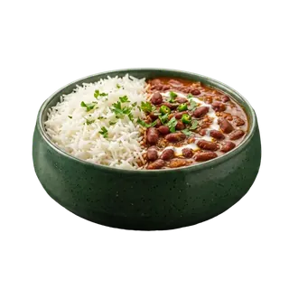
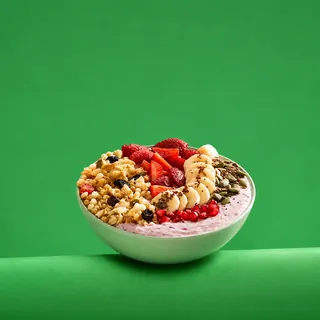
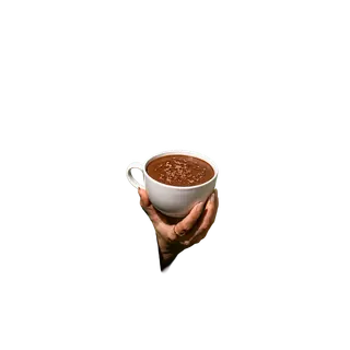
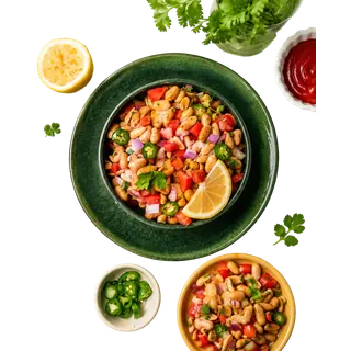
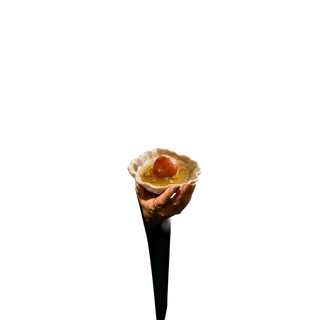
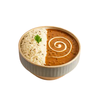
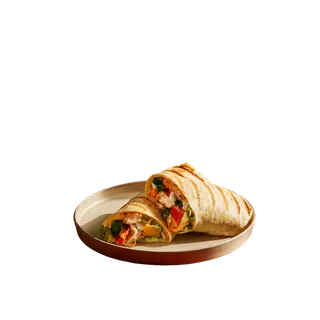
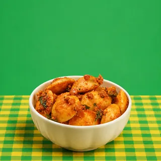
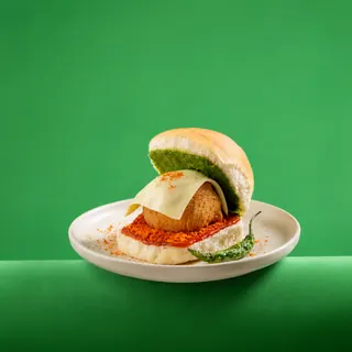
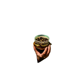
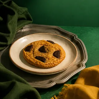
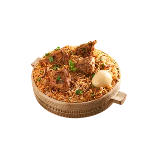
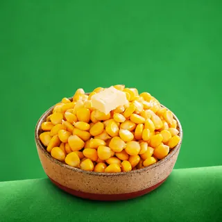
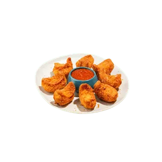
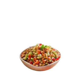
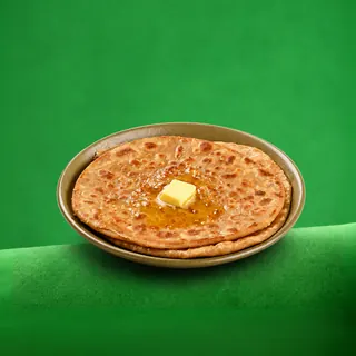
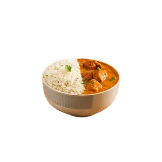
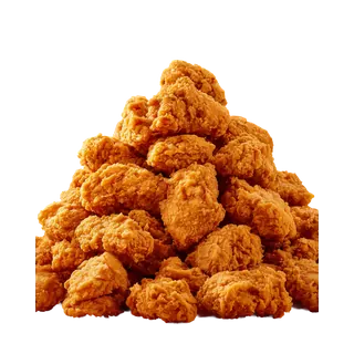
Four chaats and a plate of peri peri fries. The query shares no word with any of them, and nothing in this catalogue is filed under “street food”.
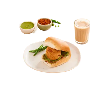
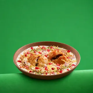
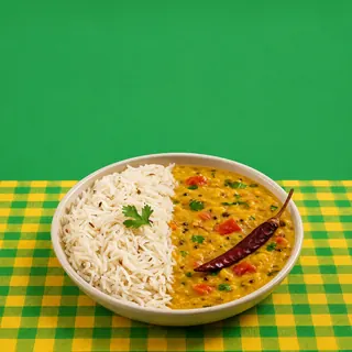
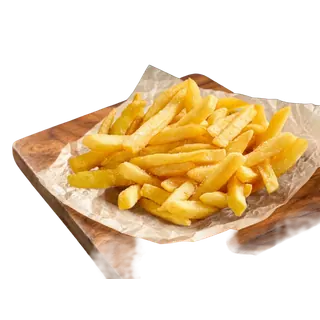

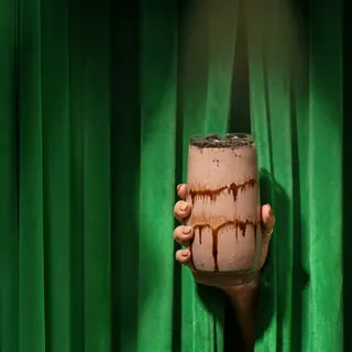
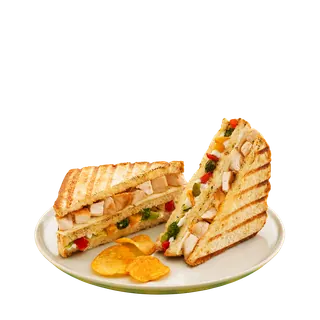
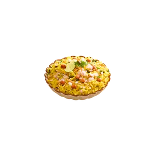
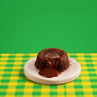
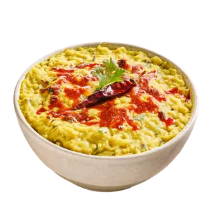
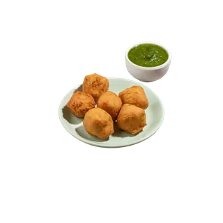
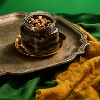
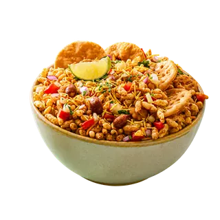
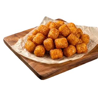
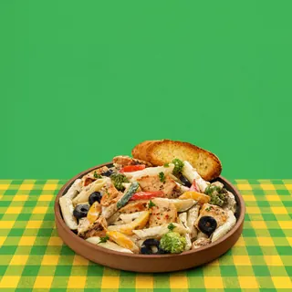
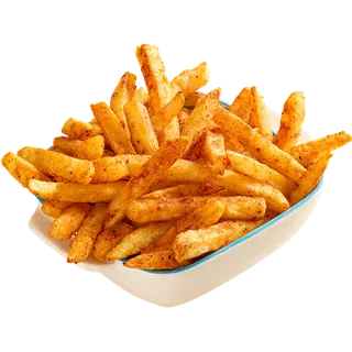
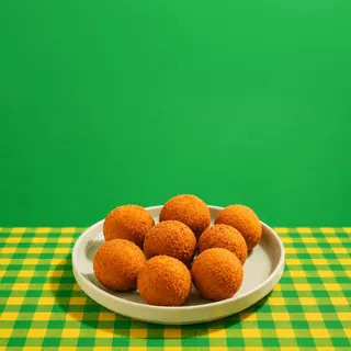
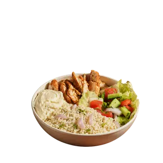
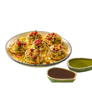
- Two indexes, not one
- Names, families and every spelling the copywriters used are one index; what the photographs show is a second. Mixing them measurably breaks lookup — on a ten-query benchmark the tight identity index scores 9/10 at top-1, and folding the photo descriptions into the same vector drops it to 2/10. A sentence about garnish is longer than a dish name, and it pulls the vector toward every other garnished bowl in the catalogue.
- It is correctable, and corrections survive
- Every label here was derived by a model and some of it is wrong, so a person can rename a SKU, promote a different hero photo, or move a creative to the SKU it actually sells. Each edit stamps the row as human and the importer skips those, which is what stops a re-import quietly reverting a fix.
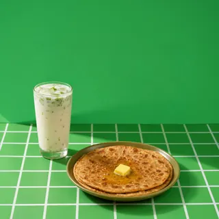
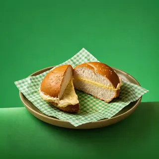
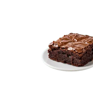
The wall is forty of the 248 photographs, one per product and spread across the families rather than taken in order. Nine shots in the catalogue carry branding in-frame; the manifest records which, and they are excluded here. Each tile's description is the one the ingest pass wrote — the same string the photo index is built on.
The same SKU, solved five times.
Pick a SKU. Every board beside its master is the same composition and none is a crop of it: the dish re-anchors, the headline re-wraps to a different number of lines, the badge and the sign change corners. The first two SKUs are the concepts the client supplied; the other three were composed from them.
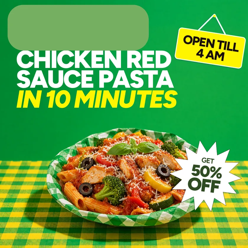
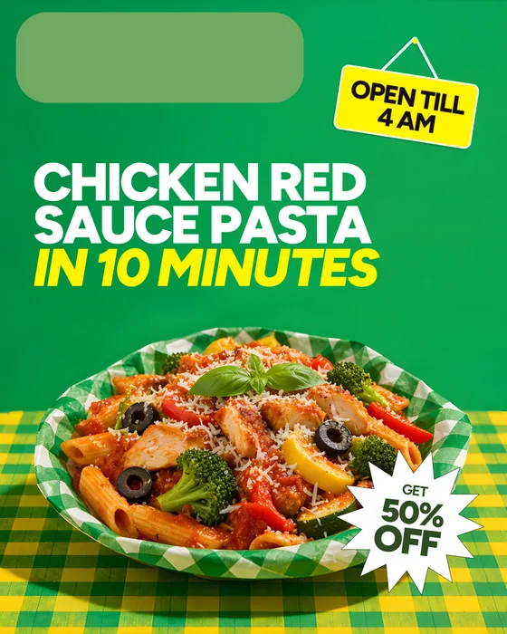
The master's width and a quarter more height, so nothing has to shrink — and the headline still re-wraps, because the extra height goes to a fourth line rather than to the dish. The badge leaves the dish and lands on the cloth.
The two 1080×1920s are different boards, not one listed twice — see the note under each.
The batch
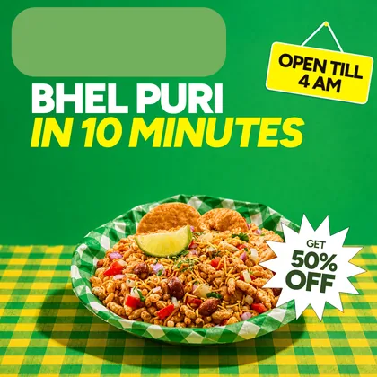
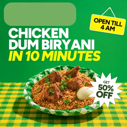
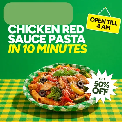
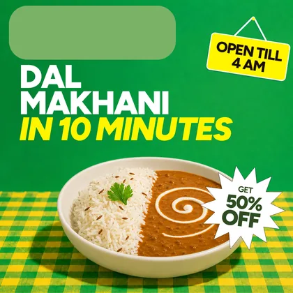
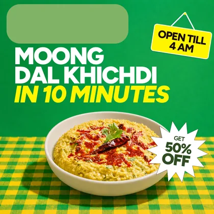
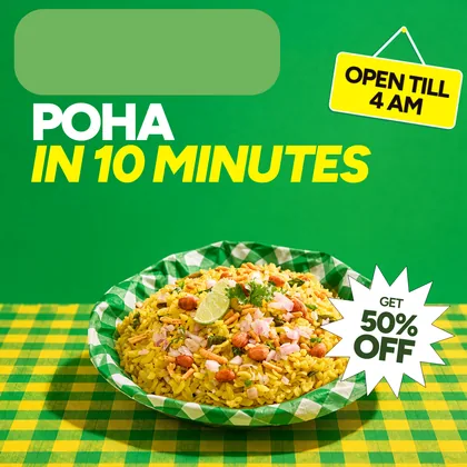
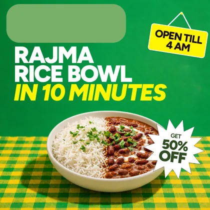
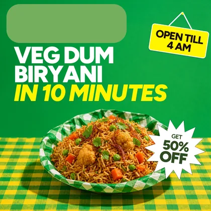
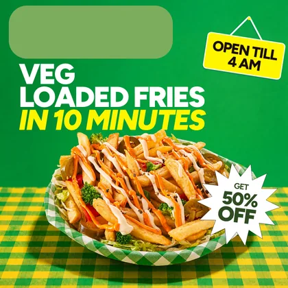
All nineteen SKUs at their 1:1 master, in the two sets they were delivered as. One run, two masters, and no SKU adapted onto the wrong one.
Master one — the savoury system
10 SKUs
A flat green wall over a gingham cloth, white headline with the promise in yellow, and the offer as a white starburst. Filed in the export as the chicken-popcorn set, after the master it was derived from.

Master two — the dessert system
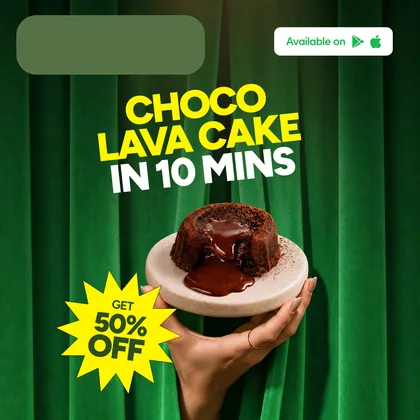
9 SKUs
A lit green curtain, a yellow headline, and the offer as a yellow starburst. A different ground, a different type colour and a different offer treatment — filed as the lotus-biscoff set.
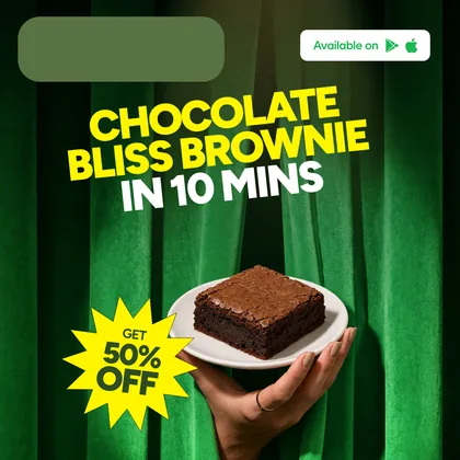
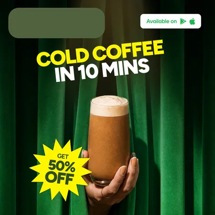
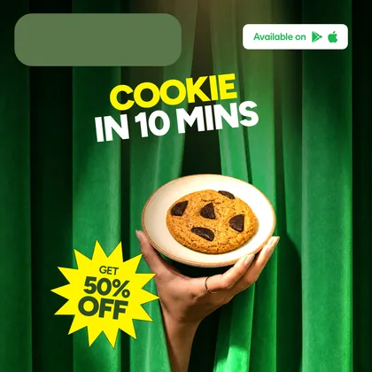
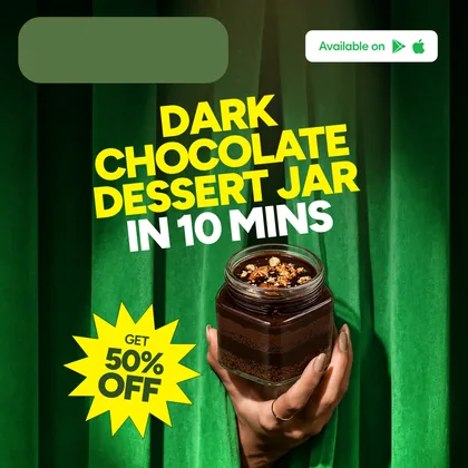
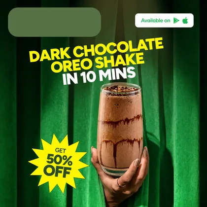
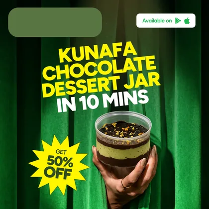
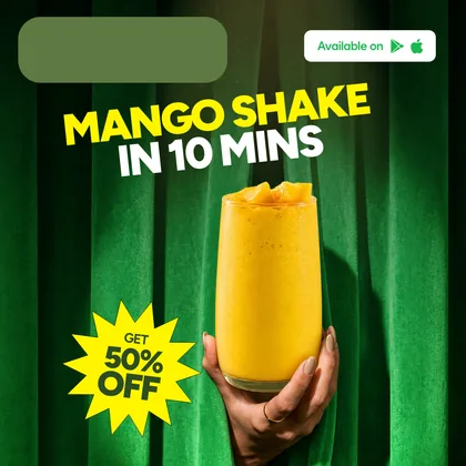
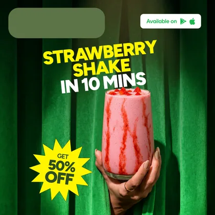
- Client not named under a confidentiality agreement. The sector is described because it is what the work was; the delivery promise printed on the creatives is the campaign's own copy and is not repeated here as a fact about the client.
- Every board shown has had the brand lockup removed by us before publication and replaced with a neutral plate, which is the treatment the film uses. Plates are our redaction, not the client's design.
- Counts are the delivered batch, taken from the export manifest: 2 master concepts, 19 SKUs, 5 formats, 95 boards. The library figures — 91 SKUs, 224 creatives, 248 photographs — are the catalogue's own, and this campaign read 162 of those creatives across the 19 SKUs it covered. The weekly cadence before and after is the client's.
A whole catalogue, adapted one SKU at a time?
Give us two approved concepts and a list of SKUs. We will catalogue the back library you already have and send back the layered boards — the same run this case describes.